I think one weakness I had in this particular project was not having the motivation to actually go out and film some footage for making a film like I originally planned. If I had gone out a filmed, I probably would have stuck with the film idea. However, whilst making and editing the video, I'm sure I would have made developments along the way so it would have evolve slowly and almost by itself. I probably jumped a little too far moving from a video to paper mechanism illustrations.
I think my final pieces were really nicely done and I thoroughly enjoy making them. They reminded me how much I actually like simple drawing and painting. I had totally forgotten about it in the hurry to get on with all the projects and come up with interesting ideas. I will definitely make such I keep drawing and painting in mind when I plan future projects as it's what I'm good at and what I enjoy.
If I were to complete this project again, I would have possibly done something completly different as in the end I think this idea is quite limited. I could possibly go back to the original project outline and choose to take it in completely contrasting manner.
If I were to carry on with this project I would like to go back and perhaps have another go at making the video. Or maybe even improve upon my paper mechanisms. Making them bigger or drawing/painting them in a different style.
Thursday, 8 December 2011
Display Project - Evaluation
My main weakness in this project was neglecting it. I concentrated too much on my other three projects because I didn't have such a firm idea for what I was going to do for this project. Instead, I should have concentrated on this one first until I was happy with the direction I was heading in. Then got on with the other three projects. I think I was very lucky to come up with the idea I did without having to go through too much development. I certainly won't leave it to chance in the future.
I think my actual idea was quite interesting and my making process was quite methodical and functional. I would like to use it again but don't know whether it could be applied to other projects.
If I were to complete this project again I would start on it a lot earlier than I did and give it a more equal amount of time and effort compared to the other projects. I think I would also liked to have investigated using more types of written word to insert in to the alphabetised graph format such as books, quotes, poems and speeches.
If I were to carry on with this project I would like the try out making an animation or digital piece based on the music equaliser that was suggested to me. I think this would develop this project quite a bit but still keep the core idea and method the same.
Image Project - Evaluation
With this project I completed lots of research so I was very inspired and motivated but this detracted from time I could have spent actually making work and trying out ideas. I should have condensed down my research and limited myself a little more. I also think I should have tried out more of my preliminary ideas. I had ideas about t-shirt prints and animation, but stuck with plain old collage. I don't know why I didn't investigate the other ideas. I should have done so, and I probably would have come up with a much better idea that the one I ended up with.
However, saying that. I do quite like my final piece for this project and think I did a good job on these last pieces. I chose the magazine picture well, cut out the shapes with care and arranged them in pairs appropriately. I also think that you can see influence from a number of different artists I researched.
If I were to complete this project again I would defainetly try out a wider variety of ideas rather than just sticking with simple collage. I would again condense my research time and increase my development time.
If I were to carry on with project I would like to try transfering my ideas to other mediums perhaps making an entire zine out of malfunctioning magazine images or something a bit more unusual like an animation of the images malfunctioning.
Object Project - Evaluation
I think I researched quite proficiently in this project. I looked at a wide variety of sources and also with an appropriate amount of detail. This really helped me with inspiration and gave my ideas some structure. However, one thing I know I can improve is condensing down my research and being more selective about what I use and don't use. I also spent a lot of time on this part of the project and probably should have been trying out more ideas instead.
I think I did well finding the bottles I did. They all go together quite nicely and are nice sizes in my opinion. I also think I did a good job on making the corks for the bottles. I had regular sized corks and 6 strangely sized bottles so I had to carved the cork to the correct size or glue 2 corks together to make a large one. This made the bottles look alot more appropriate. I'm glad I took the time to make these.
If I were to complete this project again I would definately spend less time researching and more time trying out ideas. This would ultimately mean I achieve more developed and thought out ideas. I may also come up with an even better and more appropriate idea than I did this time.
If I were to carry on with this project and develop it further I would investigate using other measurble materials to put into each bottle to create size comparisons. Perhaps more unusual lengths of something, or perhaps equally sized squares of a certain fabric or material.
Display of Final Pieces
Here are the final pieces from all four of my projects displayed in the studio ready for marking and on time a day before the deadline.


I would have liked one or two more boards worth of space to spread everything out a little more but it was quite cramped in the the studio I was in and I didn't want to be greedy. I ended up moving my plinth round to how I originally had it also because of limited space. I turned it so it was perpendicular to the wall rather than parallel with it. It is a little unusual but I don't think it detracts from the work. If I had more space I would have displayed all three wall pieces at eye level. I would also put the magazine pieces in a long line rather than the weird formation I have here due to space constraints.
Context Project - Final Piece
My tutor said that this was the weakest out of all 4 of my projects because it had changed so much from the original idea and had lost its meaning a little bit. I also feel that I should have tried harder to finish the piece in time for the group tutorial. That way I think I might have gotten my idea across more effectively. My tutor also said I should concentrate on finishing my other three projects first and come back to this when I was done. So I listened to his comments and those of the other students and once I had done the other three projects I carried on with them. I completed them in virtually the same way I was planning to in the first place. But I made them alot more glitchy and quirky. So this way they weren't just paper mechanisms of malfuntioning objects. The paper itself was malfunctioning so that they could not be interacted with correctly. I know it's probably not my strongest project but I did really enjoy making them and will definately pursue more paper mechanics in the future.


Display Project - Final Piece
At the group tutorial my tutor and they other student responded well to this piece of work but agreed with me that I should have presented it a bit better rather than on sheets of A4 copier paper. I said that I would have it printed to a much higher quality in time for the deadline. They also said that the lyric graphs looked like city skylines and music equalisers found on sound equipment. So the tutor made suggestions about making an animation of an music equaliser but with the lyrics for the bars. I wasn't really keen on making an animation as I wasn't confident enough in my animation skills and I also would only have a week to complete it in. I also thought that was a little obvious with it being lyrics and a music equaliser. So I voiced my opinion to the group. They then said I could perhaps choose some different songs, ones in particular about cities and then make them into the lyric graphs to create city skylines. I preferred this idea as it was more subtle and not as obvious as the previous idea mentioned.
So I found 4 songs about the city and made the graphs out of them just as before. But this time I made them in a photo editing program instead of Microsoft Word so that I could convert it into a jpeg file and have it printed on the large scale printer. I put the file on a memory stick and bought it in to be printed. However, the IT Technician said that it probably wasn't good enough quality and I hadn't saved it as a big enough size for it to come out in super crisp condition. However, we did a small print sample and I was quite happy with the quality so we went ahead and printed it anyway. I am really pleased with the way it turned out as I think its a nice idea and I executed it quite well. However, I probably should have planned ahead and had it printed much earlier than the last week before the deadline. That way I could have remade the image to a higher quality. I will definitely keep this in mind for future projects that require large scale printing.

So I found 4 songs about the city and made the graphs out of them just as before. But this time I made them in a photo editing program instead of Microsoft Word so that I could convert it into a jpeg file and have it printed on the large scale printer. I put the file on a memory stick and bought it in to be printed. However, the IT Technician said that it probably wasn't good enough quality and I hadn't saved it as a big enough size for it to come out in super crisp condition. However, we did a small print sample and I was quite happy with the quality so we went ahead and printed it anyway. I am really pleased with the way it turned out as I think its a nice idea and I executed it quite well. However, I probably should have planned ahead and had it printed much earlier than the last week before the deadline. That way I could have remade the image to a higher quality. I will definitely keep this in mind for future projects that require large scale printing.

Here it is put up on the wall in preparation for the final deadline.
Image Project - Final Piece
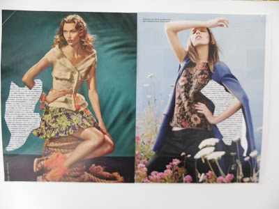
In the group tutorial I got the most positive feedback about one of the rearrange magazine pieces in particular. In it I had cut out a shape like all the others and put the binary code text behind it. But it was quite an ambiguous shape that I had cut out and it took a while for them to work out what it was meant to be. So I decided to stay with this idea and cut out much more random and strange shapes rather than recognisable ones. I also arranged them in equally sized pairs so that they looked like double page magazine spreads a little bit, which obviously references their original purpose. I also paired them together quite selectively so they made symmetrical or vaguely matching compositions. I also mounted them on to some thich card so that they were a little mroe substantial and wouldn't crease so easily.


Object Project - Final Piece
During the group tutorial I received good feedback about my piece but the tutor said that there wasn't a big enough contrast between the two biggest bottles. He said that adding atleast one more big bottle would improve the piece greatly. So I found 2 more bigger bottles and filled them with the same length of thread. I had also only displayed it on a windowsill, so I planned to make a plinth to display the work properly. Here is the plinth I made and the finished work displayed on it in my space in the studio.


This was the first project I finished and put up in the studio, and I thought it looked really nice on it's own. But I had plenty more work to put up so it got alot more cramped over the next three days.
Thursday, 1 December 2011
Context Project Final Ideas
After the group critique, I had a think about this project and decided to change from a video to some sort of illustration. I did some simple drawings based on the story board I made for my video, as the theme and subjects would still be the same.

I then decided to make some clean and crisp ink pen and watercolour pieces of the different objects that were malfunctioning. I then thought back to an original idea I had about making some drawings that were interactive e.g. with push/pull tabs and wheels to turn. So I have been pursuing this idea. I worked out in my head how I would make each one 'work' and then started on making the actual pieces.
I have only completed the 'sink and tap' piece, but I think I may even redo that one to improve it a little. The 'traffic lights' piece is half done, I have almost finished the painting and I just have to make and attach the movable part. The other 4 are only the ink pen drawings, with pencil sketchings of the parts that will move and the tabs/ flaps that will allow them to move. Plus I also have to paint them. But I think this is a fairly decent representation of my idea for the Group Tutorial and a week is plenty of time to finish them off.

I was also thinking about incorporating a sound element, as suggested by my tutor in the group critique. But I haven't started any of that, so maybe it's a little late. Maybe these interactive drawings are enough and they don't need the sound. I will see what it said in the Group Tutorial tomorrow.
Display Project Final Ideas
So I for this project I made a few more song lyric graphs from a wider type of song. I now have 6 to choose from. Its pretty hard to photograph it because the type is so small, but I tried my best.

This is how I have displayed it for the Group Tutorial. I tried again to get my printer and computer to print on long strips of paper, but they would not co-operate. So I printed them all off on normal printer paper and blue-tacked them to the wall in groups and strips. I chose four that I felt showed the contrasted best between the song types.
The paper went a little crumply once I blue-tacked it to the wall, so for my final hand in I am going to re-print on card instead, so it doesn't crease so easily. I will also bring a spirit level as it was extremely difficult to get them level. I was also in two minds as to whether I should put the name of the song and artist. I decided to leave it for now because I thought it might make it too obvious. I wanted to see if people could make out what the songs were from the lyrics. I will see what is said tomorrow in the Group Tutorial and make my decisions based on that.
Image Project Final Ideas
After the group critique I decided to pursue the idea of including text with the images. Specifically, where I cut out certain shapes and the text shows though underneath. With this piece I cut out the cars in the picture. Then what were yellow taxi cabs became pieces of yellow text. The normal cars become pieces of white text. I quite liked how this turned out but I still didn't have a real idea behind what the pictures were going to be about.

 This is also how I have displayed it in the studio for the Group Tutorial. I may have to rethink the display method depending on what comments I get back tomorrow. But I am fairly happy with it. I thought about putting it back into a magazine or book form, but I really wanted it displayed something like this to completely repurpose it as stereotypical art on a gallery wall rather than the commerical photography it is. However, if I am going to stay with the theme of malfunction maybe I should piece it back together as a 'Frankenstein-like' magazine to show the printing errors in their true surroundings. I will have to wait and see.

So, I decided to link this project with the idea for my context project which was about 'Malfunctioning Objects'. I thought I could cut out some bit of images from magazines and then use the text to show that that part of the image had malfunctioned. This could be a malfunction on a computer screen when an image doesn't load properly or a malfunction in the printing process where the image does come out quite right. I completed these pieces using a sheet of computer binary code (0100100000111110111) as the text filler.

Object Project Final Ideas
After the group critique I decided to head in a different direction with my bottle work. I tried out numerous different types and lengths of threads in the bottles to show size comparison relative to each bottle.
Here are a few of the different ideas I tried.


Here are a few of the different ideas I tried.


In these bottles I put 6 metres of pink thread. I lodged one end of the thread next to the cork on each bottle and bundled up the rest of the thread into the bottle.

In this one I made the thread bundle suspend in the middle of each bottle.

Here I used some thicker ribbon like thread in black. This time I put 5 foot 4 1/2 inches in each bottle, which is my height.


I also tried out a few ideas with white balloons but everything I tried looked so rubbish I didn't take any photos and forgot about that idea completely.

Here is the thread I eventually settled on. It is roughly the shape thickness as the previous thread, but this one is slightly see through. I think this gives a better effect because when it is bundled up in the tiniest bottle it looks much darker. As with the largest bottle it appears much lighter because there aren't as many thread layers.

I also decided to change my largest bottle to a slightly smaller one. This was mainly because my original large bottle had a slightly blue tinge, and I felt this distracted from what was actually in the bottles. I feel this new one is a much better fit.
The idea I have come up with for the meaning behind these bottles and the thread is probably a little vague but maybe its enough. To me it's about how a person can appear big/important/dominant in a small group/situation/story, but can appear insignificant in a much larger one. It sort of deals with shyness which has always been an issue for me, but does change depending on the situation. Like how many people I'm around or how big a group I have to speak to.
Based on this idea, I thought about maybe filling the rest of the bottle with something else to help represent 'everything/everyone else'. But for now I am going to see how it is received in tomorrow's Group Tutorial.
For the Group Tutorial tomorrow I have displayed my bottles on a window sill as this was the only available surface I could use at short notice. In hind sight, I should have planned better and made a plinth for them much earlier.

However, I have booked a workshop session in order to make a plinth next week. So, I will have a plinth to display them on in time for the final deadline in a weeks time.
Metal Workshop
In this final workshop we were shown lots of different metal techniques and also how to use the various machines around the workshop. We were given a choice of different metals to work with. I chose copper. I decided to make a bangle. This involved using a variety of machines and tools such as the rolling machine, the polishing machine and the blow-torch. As well as several techniques such as silver soldering, polishing and shaping metal into a loop.


 I am actually really pleased with how it turned out. Even though the solder wasn't as clean as it could have been, I think it adds to the aged effect I eventually went with. I like how when I polished it, some of the polishing wax was left in he small crevices. I think this makes it a lot more interesting and emphasises the cross pattern. I'll definitely pursue using the metal and jewellery workshops again in the future and would love to complete more pieces similar in style to the one I have created here.


Premiere and Illustrator Workshop
I completely forgot about posting the work I did in this workshop! We had a one day workshop on using Adobe Premiere and another day on Adobe Illustrator and a little on Adobe Flash. This was the video I made using random clips given to me and all the different skills I had been taught during the day.
For the Illustrator and Flash workshop day we made a small illustration from a photograph and then imported it into to Flash to create a short animation using tools such as Shape Tween. I can't work out how to put flash files into this blog. However, at the end of the day all my work went onto a group memory stick that went to the Head Tutor, so there is evidence of the work I did in the hands that need it.
Friday, 25 November 2011
Wood Workshop
In this workshop, we were put into small groups and given a woodwork machine to simplify and replicate to 1/6 scale. I was a bit unsure as to how this workshop was going to pan out, as I don't really enjoy group work. But once I got into the work we had been given, it wasn't all that bad. my group was given the sanding machine.


So we measure all the different aspects of the machine and then divided each figure by 6 to get the scaled down measurements. Here are the diagrams we used to help work out the dimensions.


Then we collected some scrap wood and drew out all the pieces. We then cut them out and sanded them. The two round shapes on the machine were quite tricky but I think we handled them quite well. We then glued all the pieces together and added some thick aluminium wire for two of the pipes on the machine for a final finishing touch.


Textiles Workshop
In this workshop we were given three huge piles of scrap fabrics to go through and make something that was supported by the body. I was really looking forward to this workshop as I have had much chance to use my skills in this particular area. I decided to make a shoulder piece. I started off my covering a few pieces of foam padding and shoulder pads with different fabrics and then arranged them on a large loop of elastic and fake-leather base. I then kept adding various triangles of fabric to build up the structure of the piece and then photographed my progress in the photography scoop.

 I also took a few pieces of scrap fabric home with me in order to finish it off completely.


I really enjoyed this workshop and although it doesn't relate to any of my current projects I will definitely keep this idea in mind for future projects.
Subscribe to:
Posts (Atom)