With this project I completed lots of research so I was very inspired and motivated but this detracted from time I could have spent actually making work and trying out ideas. I should have condensed down my research and limited myself a little more. I also think I should have tried out more of my preliminary ideas. I had ideas about t-shirt prints and animation, but stuck with plain old collage. I don't know why I didn't investigate the other ideas. I should have done so, and I probably would have come up with a much better idea that the one I ended up with.
However, saying that. I do quite like my final piece for this project and think I did a good job on these last pieces. I chose the magazine picture well, cut out the shapes with care and arranged them in pairs appropriately. I also think that you can see influence from a number of different artists I researched.
If I were to complete this project again I would defainetly try out a wider variety of ideas rather than just sticking with simple collage. I would again condense my research time and increase my development time.
If I were to carry on with project I would like to try transfering my ideas to other mediums perhaps making an entire zine out of malfunctioning magazine images or something a bit more unusual like an animation of the images malfunctioning.
Showing posts with label Rearrange Magazine Project. Show all posts
Showing posts with label Rearrange Magazine Project. Show all posts
Thursday, 8 December 2011
Display of Final Pieces
Here are the final pieces from all four of my projects displayed in the studio ready for marking and on time a day before the deadline.


I would have liked one or two more boards worth of space to spread everything out a little more but it was quite cramped in the the studio I was in and I didn't want to be greedy. I ended up moving my plinth round to how I originally had it also because of limited space. I turned it so it was perpendicular to the wall rather than parallel with it. It is a little unusual but I don't think it detracts from the work. If I had more space I would have displayed all three wall pieces at eye level. I would also put the magazine pieces in a long line rather than the weird formation I have here due to space constraints.
Image Project - Final Piece
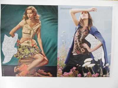
In the group tutorial I got the most positive feedback about one of the rearrange magazine pieces in particular. In it I had cut out a shape like all the others and put the binary code text behind it. But it was quite an ambiguous shape that I had cut out and it took a while for them to work out what it was meant to be. So I decided to stay with this idea and cut out much more random and strange shapes rather than recognisable ones. I also arranged them in equally sized pairs so that they looked like double page magazine spreads a little bit, which obviously references their original purpose. I also paired them together quite selectively so they made symmetrical or vaguely matching compositions. I also mounted them on to some thich card so that they were a little mroe substantial and wouldn't crease so easily.


Thursday, 1 December 2011
Image Project Final Ideas
After the group critique I decided to pursue the idea of including text with the images. Specifically, where I cut out certain shapes and the text shows though underneath. With this piece I cut out the cars in the picture. Then what were yellow taxi cabs became pieces of yellow text. The normal cars become pieces of white text. I quite liked how this turned out but I still didn't have a real idea behind what the pictures were going to be about.

 This is also how I have displayed it in the studio for the Group Tutorial. I may have to rethink the display method depending on what comments I get back tomorrow. But I am fairly happy with it. I thought about putting it back into a magazine or book form, but I really wanted it displayed something like this to completely repurpose it as stereotypical art on a gallery wall rather than the commerical photography it is. However, if I am going to stay with the theme of malfunction maybe I should piece it back together as a 'Frankenstein-like' magazine to show the printing errors in their true surroundings. I will have to wait and see.

So, I decided to link this project with the idea for my context project which was about 'Malfunctioning Objects'. I thought I could cut out some bit of images from magazines and then use the text to show that that part of the image had malfunctioned. This could be a malfunction on a computer screen when an image doesn't load properly or a malfunction in the printing process where the image does come out quite right. I completed these pieces using a sheet of computer binary code (0100100000111110111) as the text filler.

Sunday, 13 November 2011
Rearrange Magazine Development
I tried out some more ideas for this project. I drew alot of inspiration from the artist research I
had done. (There were lots more than this but I chose these as what I thought were the better ones.)


I also completed a brainstorm sheet for display ideas. I tried to thing of way to display them that would remove them from their magazine context, but also thought about re-printing them as a zine/book to put them back into their original context.

After a group crit and thorough discussion with my tutor I am going to try and incorporate cutting through the image to reveal text, and also some drawing/painting work to make the pieces more diverse and interesting. But I still need to think of an idea or meaning to base my work on. My tutor recommended combining projects so perhaps I could bring the themes from my other three projects into this piece to give it more direction and significance.
Sunday, 30 October 2011
Image Project Research
I got three books from the library for this project. I was quite surprised how many books they had on this particular subject, so I had plenty of research material to choose from.
Collage: The Unmonumental Picture


 In this series the artist uses black and white factual newspaper images and repurposes them into emblem-like patterns. I really like this idea because it completely changes the images purpose from conveying and communication facts into an art piece. This fact that they are black and white makes them also feel quite old and somewhat precious. The vague symmetry nods to coats of arms in my mind too. I think this is a very good example of rearranging and repurposing magazine/newspaper imagery, and so is a perfect research source.
John Stezaker (The artists most recent exhibition can be seen here)
This artist actually featured in 2 of the 3 books, but this particular book showcased what I think is some of the best of his work.


 Ludovica Gioscia http://www.ludovicagioscia.com/
 This artist has layered both mass-produced and handmade screen-printed wallpaper then torn and ripped into it to reference billboards and illegal fly-poster sites. The book also says it points to the 'visual immediacy and transient nature of disposable consumer culture'. I really like the idea behind this work and I think it does a good job of changing the purpose of wallpaper and representing the ugliness of torn flyers in a more visually appealing way.
Ian Dawson http://www.iandawson.net/


 This artist has condensed long films/TV series into pieces lasting a few minutes. The artist amplifies certain important images and makes others very transparent to create a short representation of the film/series. This is a really interesting interpretation of the collage medium. This is a great way to summarise a long piece of film. I don't think I want to make a 'film collage' like this one because I am already completing a video for another project, but it is still an interesting idea to consider and will still possibly influence my work.
Claire Harvey http://claireharvey.net/
 This piece is an interesting way of completing a collage called 'Easily Removable People'. Here the artist has traced over some magazine images of people doing menial, solitary, everyday actions on to scotch tape and acetate and then layered then together on a white wall to create what is in essence still a collage. The people are easily removable in that they are attached with tape and also that because they were not interacting with anyone in the images, they could be easily removed from their surroundings and isolated. I really like this piece because although it does use magazine/newspaper images as a starting point it takes it further and develops it into something much more interesting. Plus it is just such a great concept.
Layla Curtis http://www.laylacurtis.com/work/display/2-collage


 This artists uses juxtaposed magazine images to create plays on scale and perspective. Mixing vast open spaces with with domestic images in this way produces abstract and surreal compositions. I really like this subtle method of collage and think it generates a much more interesting outcome than a simple montage of images. I would love to try out this idea myself and see if it leads my project anywhere.
Sarah Bridgland http://www.sarahbridgland.com/index.html
 This artist uses vintage images and boxes to create these miniature collage sculpture pieces. They are hectic and somewhat random, but because they are made of paper, they feel very fragile. This work really jumped out at me as innovative and is a great use of vintage ephemera. I would love to complete some work like this and will definitely be trying out some 3D collage ideas.
Cutting Edges: Contemporary Collage

 This artist has used collaged images to create diamonds/gems by using different geometric shaped pieces to portray the facets of the stone. I can't find out the intent of these pieces even from the website, but I do really like the effect of the bright collage and the dull brown paper. It is a really effective method for recreating the look of a diamond/gem. From his website I have also seen that he uses lots of vintage images to create very modern collages. If I could stumble upon a large collection of vintage imagery, I would definitely use it in my work. However, it is very sought after and quite a common occurrence in a lot of collage work, so maybe it would be too cliche.
David Plunkert http://www.spurdesign.com/plunkert/index.html

 This artists uses old photographs of people at graveyards with the people cut out to show printed obituaries layered underneath. I think this idea is really fascinating and the materials used are very thought provoking. It is also very dark compared to alot of the other work in the books have used. I may use this as inspiration as far as I may mix image and text in a similar fashion.
Vincent Pachero http://mudchickenart.com/
 This artists work really interested me because he subtracts from magazine images rather than adding them together, the book describes it as 'decollage'. This work really surprised me as I wouldn't have thought it would be classed as collage or included in this book. I will definitely be considering working with this idea myself and incorporating it into my image project.
Collage: The Unmonumental Picture

Jonathan Hernandez - Rongwrong Series


John Stezaker (The artists most recent exhibition can be seen here)
This artist actually featured in 2 of the 3 books, but this particular book showcased what I think is some of the best of his work.


This artist uses a very subtle form of collage, only ever 2 or 3 images. But I think this makes it more effective and powerful. A lot of the images focus on early cinema icons, film stills and other vintage images which contrasts nicely with the modern feel of juxtaposing the images together. It creates very surreal portraits, and the combination of 2 people creates a completely new being. I am a big fan of this artist's work but it is quite hard to draw inspiration from it because it is so subtle and simple, it would be easy to mistakenly copy the style. But I may still try to integrate the feel of the work into my own project.
Here are some more of my favourite John Stezaker images that I feel show a bit more variety to his work. The landscape images echo the faces of the characters in the portrait pictures. I think this is extremely clever.


-------------------------------------------------------------------------------------------------------------
Collage: Assembling Contemporary Art


Ian Dawson http://www.iandawson.net/

Here the artist has pasted magazine images into a book and then cut through the pages to reveal different parts of the images. The emphasis is however on the shapes he creates rather than the actual images uses because they become indecipherable when only a little piece of each page shows through. The books says 'Dawson removes the object's original utility, turning a factory processed artifact (the book and the magazines) back into a man-made object.' I think this is a perfect way to describe what he does. I really like these pieces because the collage translates well to sculpture, and these are virtually sculptures. This has shown me that I could feasibly complete a sculptural piece as the final piece for this project and that it might be more interesting than a simply flat collage.
Leslie Shows http://leslieshows.com/

This artists uses various materials including collaged images to create 'frozen, depopulated landscapes.' I think this is a really unusual way of reusing magazine images for a different purpose, although it is almost impossible to recognise the images. But that is probably the aim of the piece. I also could possibly use collected images to create an abstract landscape or scenic setting like this one, but maybe make it more figurative, and the magazine pictures more obvious.
Sheena Macrae http://www.sheenamacrae.com/v2/home/index.php

Claire Harvey http://claireharvey.net/

Layla Curtis http://www.laylacurtis.com/work/display/2-collage

This artist collages different scaled maps to create easily recognisable land masses, that at first glance appear to be correct but on closer inspection are completely wrong. For example, the map of the world shown above is actually made from squares of an American topographical map to vaguely set out the continents as we know them. I think this is a really fascinating idea and although I'm sure artists have used maps in their work before, I don't think I've ever since then used to make completely unique maps.
Phillip Estund http://phillipestlund.com/


Sarah Bridgland http://www.sarahbridgland.com/index.html

-------------------------------------------------------------------------------------------------------------
Cutting Edges: Contemporary Collage

This book although relatively new was not as good as the others as it did not provide any explanation behind the artist's intentions, which meant it was hard to know what the artists were trying to achieve without looking it up online. But I'm still including it as it did have some different and interesting artists to the other two books.
Bill Zindel http://www.billzindel.com/

David Plunkert http://www.spurdesign.com/plunkert/index.html

This artist uses lots of vintage images to create 'couples'. I think this type of character design is quite intriguing, and is not something I would usually draw inspiration from. But it really caught my attention while was looking through the book. Again, the book or the website give no hints as to the intent behind the pieces, but I think they are good enough pieces on their own without needing any pretentious implications.
Greg Sand http://www.gregsand.net/

Vincent Pachero http://mudchickenart.com/

I am really glad I've completed this book research as it has really help me think of other final outcomes for my project which I would have other wise never thought of. I now plan to complete some more ideas with magazine images, and will be taking all this research into account whilst I do that until I find something that really appeals to me.
Monday, 17 October 2011
Image Project - Rearrange Magazine
This is the work I did for the 'Image Project' (Appropriate, rearrange and reanimate all the images from a single magazine or newspaper.) I have some artists lined up that I plan to research thoroughly, but again I just wanted to get in and try out the idea I had to see if it was worth it. So I cut out almost all the image from a single magazine. The first idea I tried out didn't go so great. It just didn't look as nice on paper as it did in my head.

So, I tried a different approach. I took all the pictures, jumbled them up and spread them out a little. Then I cut a square hole out of a piece of paper and used this over the jumbled images to help create a snap shot of each random composition. Then photographed it and moved them around some more. I carried on until I had lots and lots of them. I really liked this effect, but think it may be a little simple to stand on its own. I will have to develop it further so that it fits the project outline a little more.


The rest of the photos can be found on my Flickr here.
I planned to make a few of these photo montages and then use them inspiration for a series of photographs, paintings, illustrations or perhaps t-shirt prints so they were appropriated and reanimated into a different context.


The rest of the photos can be found on my Flickr here.
I planned to make a few of these photo montages and then use them inspiration for a series of photographs, paintings, illustrations or perhaps t-shirt prints so they were appropriated and reanimated into a different context.
Subscribe to:
Posts (Atom)