Saturday 12 May 2012

Finishing and Displaying Piece

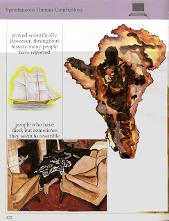
So I managed to finish painting the illustrations with a couple of days to spare and then edited them on to the new pages in about a day and here they are. I made them as separate pages because of how I had to print them, but here I have presented them next to their double-page spread counterparts.


I am fairly pleased with how they turned out. Obviously if I had a little more time to make them I would have liked to draw them myself instead of tracing from pictures. But that is completely my fault because of how lazy I was for the first few weeks. But I'm happy with how a lot of the painting turned out, and I don't think I could have improved any of that.

So I printed each page, then cut them to size and stuck them down over the original pages in the book. Then placed the book on my blue bookcase.


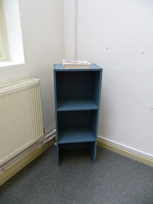
I decided to put in the this corner of the studio because it's quite out of the way and doesn't obstruct any board space that someone might need to use. I may move it slightly on Monday morning if I change my mind, but I'm content with current position.


These are what the each of the pages look like in the book when the book is open on display. One dilemma I do have is what position to have the book in. I could have it closed, and the viewer must find the pages or open on one of the pages, or open just before the pages. I'm not quite sure.

I was going to put a little sign that says 'PLEASE BROWSE' on the bookcase, but now I think I might include it on the name plaque I put on the wall next to my piece. I think it might be best if I open the book on the page before the first page that I have made, so they don't have far to go to find what I have made.

Monday 7 May 2012

Progress

So I settled on 5 themes for 5 double page spreads. They are:
  • Plane Crashes/Accidents
  • Animals Attacks
  • Premature Burial/Being Buried Alive
  • Spontaneous Human Combustion
  • Execution/Capital Punishment
I've collected lots of reference images for all 5 themes and have chosen 3-4 images for each subject to trace from and then paint. I've tried to strike a balance between gory/extreme pictures and middle-of-the-ground images that are slightly comical which I hope will make the pages shocking enough without being too distasteful.

Here are a couple of the pieces I have done so far. I will be tweaking and editing them before adding them to the the final piece to give them a little more polish and professionalism, so please excuse any that are a little wonky.


I have another tutorial tomorrow so I'm going to take in what I have done so far and see if the tutors think its any good. Then I'll be spending the rest of tomorrow and Wednesday painting the remaining pictures and editing them on to the pages. I'll hopefully then print on Thursday and have it all set up by Friday, fingers crossed.

Friday 4 May 2012

Tutorial

I had a quick tutorial with one of my tutors yesterday. I explained briefly how my idea had developed. He liked what I was planning but said it would fit more with the context if I were to illustrate the fears to fit with the theme of the book. He also said because of time constraints I should just stick to only this book, and also maybe concentrate on completing fewer pages to a higher standard, rather than all of the chapter at a lower quality. I also expressed my doubts about my illustration skills but he said that tracing from images and then painting them would be fine. He also liked my idea of displaying it on the little blue bookcase, because it fitted well with the context. My dad bought it to my building in his car and it's currently in the studio ready for me to use.

So I'm now gathering reference photographs to trace from and then paint. I will then scan these into my computer and put them together with the scans of the pages to new create pages. I can then either stick them into the book and present on the bookcase or mount and present them on one of the walls of the studio.

Wednesday 2 May 2012

Current Progress

I made a mock up of what I would want one of the double-page spreads to look like.


 I decided to make this about plane crashes because of the plane illustration what was already on the page. I also decided not to add any text and only use what already existed on the page by 'cutting through' some of the images. I made this inside a computer program, but for my actual piece I think I want to print off the pictures individually and physically stick them onto the pages rather than reprinting the whole page. I quite like the way it looks and hopefully my tutor will too when he sees this in my tutorial.

I also had a look through the rest of the books from my childhood and came up with a few that I thought would be suitable for this project.

I like the layout of these pages and they would be well suited to adding different chunks of text and images in the place of the original ones.  Perhaps I could bring to light some of the things that happen in religion that don't appear in this innocent children's book. E.g Westboro baptist church, religious extremists, etc


 The format of this poetry book is also simple enough that I could very easily put in an article and accompanying image to change the subject of a few of the pages.


This second poetry book would also be well suited if I wanted to be a little more subtle and just insert some alternative text over the top of the existing pages and not include images.

Now I have made one mock up page, I am wondering if I am being a little ambitious for the time I have left. Perhaps I should just stick to making my original book look as finished as possible. I will have to see how my tutorial goes and how I progress over the coming week.

Monday 30 April 2012

Childhood Bookcase

I cleaned up a small blue bookcase in preparation for displaying my books for my final piece for this project. It used to be in my room when I was young, but has since been stored away in the garage for a good few years. It had however stood the test of time well, having only a few scratches and the odd fleck of paint. But I gave it a good clean and it looks pretty decent.


In my opinion it's height is extremely well suited to my purpose because it's about 'bar' height. By which I means its a good table/surface for someone standing up i.e. you can place an open book on the top and it's at a very suitable height to read/view the book quite comfortably.


Like I said, there is is odd scratch or crack in the paint work but there is not much else I can do about this apart from repainting it completely which I don't really think I need to do. I want it to be as original as possible. Plus I love the colour.

The one thing I was a little worried about was these chipped corners on the back of the bookcase. But you can't really seeing them when viewing it from the front, and it will be up against a wall. You also have to get down really low, like I did for these photos, to see the flaws in their entirety so they shouldn't be too much of a problem.

I'm planning to put my books on the top shelf and having some sort of prompt letting the viewer know they are allowed/supposed to browse the books. Then they can hold the book in their hand or place it on the top of the bookcase and view the interventions into the pages.

I'm now off to decide on which additional books I should include in my piece and also make some mock up designs. I have a tutorial in 3 days so it is essential that I make something to show how my idea has evolved now so that the tutor can fully understand my piece.

Sunday 29 April 2012

Project Presentation

So last Thursday I had to present my idea and my progress so far to my tutor and a few other students. The reception to my idea was mixed, but my tutor said it could do with some improvement. So on advice from him I will be changing my idea slightly.

Instead of covering the pages I will now be making the scary pages much more grotesque and terrifying in order to create a very adult sinister chapter in an innocent children's book. I will also be attempting this technique with a couple of other books from my childhood to make my final piece a little more substantial. I have also got my hands on a small bookcase from my childhood that I am planning to present the books on.

So my next steps with be to try out some ideas for layouts on photocopies of some of the pages, choosing my other books to feature in my piece and cleaning up the little bookcase to present my work on.

Wednesday 25 April 2012

More Development

I tried out my idea of applying one of the phrases using letraset directly to one of the covers. I also applied a 1cm strip of sand paper to the top and bottom of the page because I realised that someone could avoid by grabbing there instead.


I really like the way it looks, and even though the text looks very small and blurry here, it is very crisp and clear when looking at the book in person.

I plan to look at some artists who deal with text and typography next to help develop my ideas.