
I got a really good book called 'Data Flow' from the library all about how data can be displayed in graphic design. It showed me lots of artists that use data as a starting point for a piece of design that I can use as research and inspiration for my 'Display' project. My project outline is:
'Who is Edward Tufte? Create an appropriate display system for some non-statistical, trivial information.'
Hörður Lárusson (website here.)
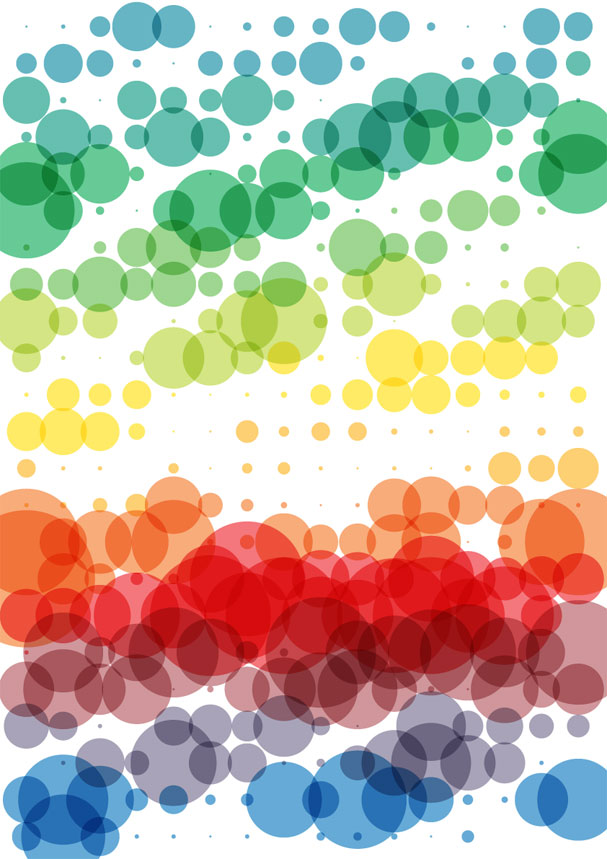
This piece of work is a display of how many emails the artist received over a year, as a measure of how much work he did. Each dot represents a day, the bigger the dot the more emails he received. I really like how much the content governs the pattern, and unless you know the meaning behind it, you have no idea what it means.
Shahee Ilyas (website here.)


This piece of work shows different world flags and their colour ratio represented as pie charts. The larger pie chart shows the colour ratio of all the flags combined. Again, this is very ambiguous unless you know the meaning behind the piece. It’s even difficult to recognise each flag when they are only shown this way.
Nicholas Felton (Feltron) (website here.)

This piece is about a yearly report of this designer’s life. It shows quite random and trivial information about him grouped into vague categories. The piece also has a lot of humour. It uses a variety of display methods such as pie charts, graphs and bars. As well as single answer statistics. I really enjoy this piece, and think it would be feasible for me to complete something along these lines for my project, perhaps presented in a booklet or zine format like shown here. This piece is from 2007 and is a little dated so I shall be using his website to look at his more recent pieces for inspiration aswell.
Stefanie Posavec (website here.)


This artist works alot with using information to govern patterns. These two pieces are made by using the words, sentences and chapters from a book. The first is very organic and uses the 'branches' to show chapters and sentences and then the bigger the 'leaf' at the end of the 'branch' the longer the sentence. The second is quite graphic and modern. It uses sentence length to dictate the length of the line, and with every new sentence the line takes a right turn. I realy enjoy both of these pieces and it has shown me a different place where I could get my trivial information from that I had not thought of before.
Michelle Allard (website here.)


So this research has really helped me start thinking about what kind of information I am going to display and how I plan to display it. I also now have the Edward Tufte book recommended in the Field Guide booklet and I will be going through it in a similar fashion very shortly.


This artists work was right at the back of the book and came with no caption or explanation. So I decided to look them up on the internet. It turns out their work isn't actually based on data, but it is very 'bar-chart' or 'graph' like. I think this work is amazing and it has expanded my horizons so that I am now considering making a sculptural piece to display my trivial information.
So this research has really helped me start thinking about what kind of information I am going to display and how I plan to display it. I also now have the Edward Tufte book recommended in the Field Guide booklet and I will be going through it in a similar fashion very shortly.
No comments:
Post a Comment